Thank you for visiting GeniusDV!
You have clicked on a legacy link that references material dedicated to certified video production and editing techniques.
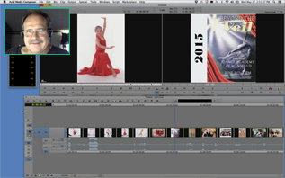
Many of these ‘text based’ tutorials have now been converted into 300+ Video Editing Tutorials.
If you don’t see your city listed, please call us or consider live one-on-one remote training.
ABOUT GENIUSDV TRAINING
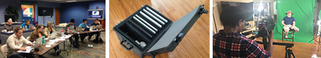
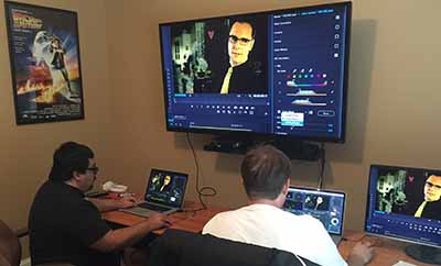
Founded in November of 2000, GeniusDV has created an elite luxurious training environment that provides state-of-the-art, hands-on training for professional industry standard video and audio editing software packages.
GeniusDV focuses on a customized one-on-one training specific to your current needs and workflow.
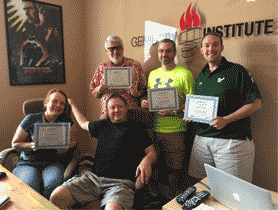
GeniusDV teaches to the current industry trends. That means that we teach outside the book and customize our classes to each individual or company’s needs. GeniusDV keeps class sizes to a minimum to ensure that we can give each student extensive individual attention.
- We Provide One-on-One Training Services
- We do NOT cancel courses
- We teach from ‘outside’ the book.
- Support does not expire
- GeniusDV only uses certified teaching professionals. They are NOT programmed staff instructors.
Get world-class video post-production training
GeniusDV offers three types of training. We can train you remotely, or travel to your location., We also schedule regular classroom training at our training facilities in Florida.
Remote Online Training
Do you need to get up to speed quickly without having to travel? Then enroll in a remote online training course. The training is designed as a one-on-one customized experience.
On-Site Training
Our instructors train and consult at studios, networks, schools, and corporations worldwide. An on-site engagement allows you to completely customize your training to your company’s needs, learn on your schedule. We will train an unlimited number of individuals for one flat rate.